Custom SeekBar in Android Studio .
In this post, you will learn to create a custom seekbar in android studio. A SeekBar is an extension of ProgressBar that adds a draggable thumb. The
user can touch the thumb and drag left or right to set the current progress
level or use the arrow keys to do so. To create a custom seekbar need follow
these steps .

- Create a drawable resource file in the drawable folder. Name it whatever you want. In this we will create a custom appearance for the thumb of the seekbar .
- Copy the following code in this drawable folder :
custom_thumb.xml:
- Now create another drawable resource file for the custom background of the seekbar .
- Paste in the following code in this.
- Now in your activity_main.xml file, copy this code :
activity_main.xml:
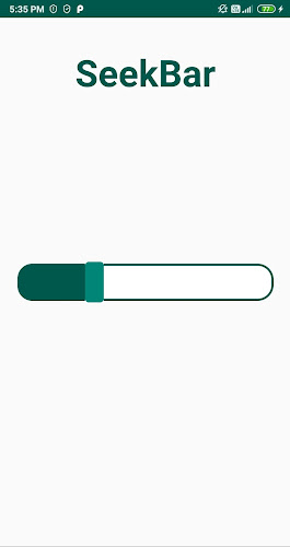
Output:


Comments
Post a Comment